Here we go – the very first of my lab reports. Back in March I shared that I was going to start giving you some behind-the-scenes scoop about my business.
My approach to business – even after 10 years – is that it’s all a test. We need to be willing to boldly experiment if we’re going to succeed. Which is my true goal with these lab reports: to share what’s working and what’s not so you can take it and run with it.
Before we go any further, I think we should stop to note that I nearly failed math in high school (more than once) and had multiple mishaps in chemistry class with the bunsen burner. Just remember, I am first and foremost a creative, a writer, a marketer…and then an analytics geek, because I love that knowing this stuff lets me get back to the creative stuff.
So right now, apologies to all the science types. This lab report takes some liberties with format and, ahem, word choice. (I’m sure my grade 11 chem teacher would give me an F for this!)
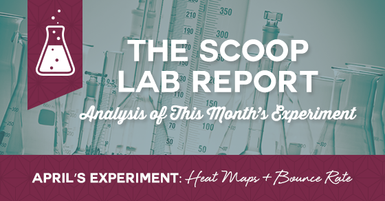
April’s big experiments focused on figuring out what was really happening on my website. I had some ideas, but I wanted to run some tests to figure it out.
Statement of Problem
After attending a two-day course on digital psychology, I was extremely curious about what was happening on my website with an eye on fine-tuning things to drive a higher number of conversions. Then I had a one-on-one conversation with Sally Hogshead from How to Fascinate, who made some very specific branding and marketing suggestions about my site. Time to dig in and see what was happening and what changes I really needed (and not just what I thought I needed to make).
Hypothesis
My initial thought was that removing the three feature boxes from the bottom of the home page will streamline decision making. Also, I thought that more emphasis should be placed on moving people to the about page from home, as it’s traditionally been the most visited page on the site.
Tools
- WordPress-based Website
- Crazy Egg
- Google Analytics
- Patience
- One copywriter + one designer
Procedure
To make data-based decisions, I started by looking at my Google Analytics. I wanted to see what my bounce rate was for the home page.
Bounce rate is a way of measuring how many people visit your home page and leave, which is a sign there may possibly be an issue with the copy or design of your home page.
With that out of the way, I then added a heatmap to my website. Heatmaps are a great way to see – visually – where the action is on your website. With a heatmap, you can follow visitor’s journey through the site and see where they are clicking, scrolling, mousing over and much more.
To prepare for the experiment in March, I first used a free plug-in heatmap for WordPress. I then switched to Crazy Egg’s heatmapping tool for more sophisticated data.
[Tweet “Do you really know what’s happening on your website? @magspatterson shares what she learned about hers.”]
Results
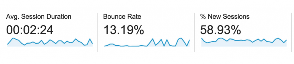
On April 1st, I quickly determined my bounce rate for the past 30 days was very good, running at 13.09% and with an average of 3.80 pages being viewed on each visit. At month’s end, my bounce rate had risen to 32.11% with 3.35 pages per visit.
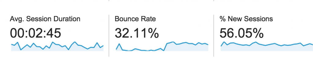
Looking at my referral traffic for April, my traffic coming from organic search rose from 15% to 24% of my total traffic, so this likely impacted my bounce rate. This is good news, but I will monitor bounce rate actively. While the current number is acceptable, if it continues to trend upwards, I may need to intervene.
Heatmaps
Lots of great insight thanks to the heatmap. The first key learning is that people actually do use the three boxes towards the bottom of my home page to route them to other pages on my site.
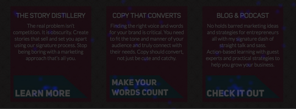
However, the click through rates for the boxes were averaging around 1-2%, so I looked closely at them and realized the calls to action were weaker than I’d like, so they were changed. As you can see in the image below, they were blue, meaning they were getting some traffic but there was lots of room for improvement.

We’ll see how the new calls to action for these three feature boxes work moving ahead, but early testing is positive.
From there, I started to look at where the real action was in my navigation bar, and it was all about services. Services received 16% of clicks on the page, with the blog receiving 13% and my about page 12%.

This prompted me to switch gears from examining my about page to my services landing page, so I promptly put a heatmap on it. Because holy shiznit – services pages are critical to my business. How could I not know exactly what was going on??? I knew business was “good,” but I wanted to know what was really happening when they hit that page.
Here’s how clicks on the services landing page breaks down:
- 13.3% on The Story Distillery
- 18.2% on Copywriting
- 10.2% on Ongoing Services
- 8.6% on Guest Posting
(And yes, I know that’s not 100, but I’ll take 50.3% clicks on services to learn more. And those other 49.7% of clicks are totally random, but interestingly, 5% of them are to my praise page.)
This accurately echoes pretty much how my services break down in terms of revenue split, and it’s no surprise that copywriting is my lead service. With that in mind, I audited the copywriting landing page and subpages with a careful eye, as that group of pages is where a good chunk of my traffic is going, so I want to do everything I can to convert them.
Working with my designer, we made a series of minor tweaks to the copywriting services page, including clearer and more prominent call to action buttons and making the invite to book a consult more visually enticing. You can see the results of those tweaks here.
We’re also fine-tuning the other services pages in an effort to improve conversions for each page and will be setting up a goal for each page in Google Analytics so we can see how we’re doing. Right now, all post-purchase thank you pages are hosted by Infusionsoft. We’ll be moving those back to WordPress so we can track them as soon as design/development changes are completed for those pages later this month.
If you want to learn more on how to set up a goal in Google Analytics, you can view the process right here:
Conclusions
My gut was totally wrong about what was happening on my home page and seeing the numbers first hand made a significant difference in the actions we took. Instead of enacting major changes, we kept what was working and started to fine tune.
Each of these changes will continue to be tracked via Google Analytics and heatmaps in the coming months, and the use of Google Analytics goals on each thank you page will let us see how many people go from landing on the site to ultimately purchasing.
Taking Action on the Lab Report
The point of the lab report is for you to get into action and take some of the testing and experimenting used here to see how you can start to use more data and facts to help you shape your marketing.
Here are a few things for you to dig into:
- What’s your bounce rate?
- What could your heatmap tell you about what visitors are doing?
- Do you know what’s happening on your services pages?
- Where can you use a goal in Google Analytics?
It’s important to keep in mind that you don’t have to have massive amounts of traffic to start digging into what’s happening. In fact, if you can figure out what’s happening now, you’ll be ready to capitalize on traffic as it rises over time. Because there’s nothing worse than traffic that you aren’t ready to actually convert into action.
That’s it. Lots learned this month about my website and what people are really doing, as well as what we need to change with an eye on improving conversion rates.
From here on out, lab reports will drop early each month and I’ve got some fun experiments planned, including:
- Can Maggie grow her Pinterest following the same way she did for a crafting business?
- Your Facebook ads cost what? Breaking down the real cost per lead.
- Adventures in list building leading up to a launch.
- And much more…
[Tweet “The first monthly lab report from @magspatterson: breaking down bounce rate and heatmaps”]