Pre-career, I had a few different jobs, from working in the video store after school rewinding the weekend’s videotapes to merchandising greeting cards for one of the giants in the industry.
When I look back, the job that taught me the very most that applies to what I do today is the 5 years I spent working in supermarkets over high school and college. The two stores I worked at couldn’t have been more different, but let me tell you, it was an education in customer service, human behavior and, most of all, psychology.
And I don’t mean the occasional verbal assault from an unruly customer who was behaving badly, or the woman who so kindly told me I was throwing away my life when little did she know I was in school full-time and working at the store 30 hours a week. (The joke’s on you lady – ha!)
The Supermarket Schools Us On Website Goals and Intentions
While I was a cashier, I loved nothing more than when I got to work in the back on displays, merchandising, stocking and more. Because nothing is left to chance in a supermarket. Which is the exact way our websites should be – we want to be intentional and guide people to the right place so they behave in a certain way.
Before you have a moment and think “Um, isn’t this manipulative?”, yes it is, but you can choose to be smart about your website or you can leave it all up to chance and see what results you get. Every retailer, corporation and business is doing it, so if you want to compete, you’re going to have to play ball.
(That’s not to say you need to turn into a sleaze ball either. You can be thoughtful and apply these ideas while still coming from place of service and ethics.)
Simeon Scamell-Katz, global consumer analyst and author of The Art of Shopping: How We Shop and Why We Buy, cites one of the biggest challenges for supermarkets is the fact that “Shopping is so ritualized that we walk around like zombies. We’re incredibly patterned in what we do.”
Sounds pretty much like the last time you lost yourself on Facebook or watching cat videos on YouTube, doesn’t it?
While Scamell-Katz’s tools of choice are brain scans, footage of volunteer’s eyeballs, live bird’s-eye views of the supermarket and more, on websites we use heatmaps, conversion rates, split tests, A/B tests and Google Analytics to get our data.
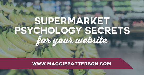
Here are a few of the lessons we can learn from supermarket psychology secrets for our own websites.
#1 Range Reduction
We’ve got more choices than ever before, but too much choice is a bad thing. This article shares that the average household uses only 300 products in a year, but a large supermarket stocks over 80,000 products.
An increasing number of brands and stores are dropping the number of products in their line in an effort to simplify. Danone cut their product line by 40% and their sales went up 20%. And in early 2015, UK supermarket giant Tesco announced they were cutting their range by 30% across the board in an bid to simplify the experience for shoppers. After all, do we really need to choose from 98 different brands of rice?
If you think about your site, how many products or services are you offering? Are you providing too much choice? It may be time for you to cull the herd and focus only on your top sellers. While less may seem like you’re going to cut into sales, more focus and simplicity will benefit both you and your potential buyers.
Start by looking at your revenue. It may have the answer of what product or service you may need to eliminate for the sake of a simpler, streamlined experience.
[Tweet “What items do you need to eliminate on your website? @magspatterson breaks it down in this new blog post.”]
#2 Signpost Brands
I’m willing to bet that you frequent the same supermarket week after week and you run off a mental map as you go through and pick things up. As shoppers, studies show that we disregard signage that tells us what’s in an aisle, favoring signpost brands. We concentrate towards the middle of an aisle and look for the recognizable brands, such as Coca-Cola or Nescafé to tell us where we are.
The positioning of signpost brands makes a significant impact on how we shop and have been shown to increase sales of all products in the category. In a study by Scamell-Katz, he advised a firm to place 4ft cardboard Guinness pint glasses at either end of the stout shelves. Overnight sales of all drinks in the category increased by 23%.
Why? It’s simple: People were being guided. Having a clear marker told them exactly where to go. So while we don’t necessarily have signpost brands for our websites, we need to look at how we can tap into the fact that people have a certain set of expectations for a website. Just like in the supermarket, our visitors are looking for the familiar and need to be guided. If you have a site that doesn’t follow a particular format or have a clear path to get them from A to B, you risk losing them. This is why clear will always trump clever, as people don’t want things to be that hard.
#3 Traffic Builder
You’ve probably heard that most supermarkets place essentials like bread and milk at the back of the store to help entice us to buy more along the way.
New studies have shown that these distraction tactics can be a major problem, as forcing the shopper to deviate from their plan can result in negative feelings. One study showed that placing quick-buy items close to the front door made people more apt to return to the store for their weekly shopping.
The message for our websites is clear: don’t make it hard to shop or try to be overly clever. Distracting us along the way means we’re less likely to return and it’s harder to build that know-like-trust factor. When you force your visitor to work too hard for what they want – it’s not creating a positive experience with your brand. And on the web, people have so many choices that in a click of a button your relationship is done and done.
There are so many secrets lurking in the supermarket and anywhere in our day-to-day lives that give us some serious clues about how to tap into the psychology of our visitors and give them what they want.
Just because we’re on the web doesn’t mean we should sacrifice common sense for creativity or a profitable website for something pretty. With the right planning and focus on user experience, we can have both. The key is understanding the psychological principles at play and assuming nothing. (Speaking of assumptions, check out how testing mine turned out in the latest lab report.)
[Tweet “Lessons from the supermarket and why common sense shouldn’t be sacrificed for creativity with @magspatterson”]