Categories
blogging content marketing strategy

The Secret of Promoting Your Blog Posts

blog 12.10

You’ve written a blog post so it’s cause for celebration. Pop the bubbly! Alert the press! You’ve got BIG THINGS to share.

Prepare for the parade of people to your site to be wowed by your genius.

If only this blogging thing was this easy.

The truth is that publishing a post is only half (or maybe even less than half) the battle. Once your little slice of genius is on the web, now you need to promote it, because if you publish it, it doesn’t mean you’ll magically have readers.

Blogging is an exercise in persistence, patience and promotion. It’s all about the long game, because while one post may be the one that sends you lots of traffic, you may find you get crickets on others and you need to build a loyal, faithful audience over time.

While you may have heard the overnight success story of a blogger who made a zillion dollars just blogging, that’s the exception and not the rule. Most blog posts don’t see the light of day, so it’s up to you to understand that to build an audience, people need to see your posts. And for them to see posts, you need to be hustling to promote them.

So while you’re furiously planning out your posts for the coming months, promotion needs to part of that plan.

Let’s break down how to promote your posts from the day of publishing and beyond:

Publishing Day

Your post is published, so now what? The question you need to answer here is how do you get eyeballs on your post and connect with YOUR audience so your content is found, read and shared.

The key is to figure out where your ideal audience can be found. Promoting to a bunch of places with wrong-for-you readers isn’t going to do much to build your business which, after all, is the point of blogging for your business.

Cultivate a list of places to promote your post based on where you know your ideal audience is. Create a checklist so that once you publish, you know you need to ensure to hit each of those places.

What should you include on your list? Here are a few suggestions:

  • Social media networks
    • Craft a series of social media updates/images for each social network
    • Call out any expert sources you refer to in your post on social media
    • Sharing in groups you’re involved in
    • Promote via an ad on Facebook
  • Reach out to influencers via email
  • Submit it to Scoop.it or Reddit
  • Answer questions with your post on Quora

That’s by no means an exhaustive list, but it’s a good place to start. Remember, this is just publishing day – day one of many of promoting your content. But get intentional, build that checklist and set aside time to promote on the day you publish.

The Week After Publishing

Extend the life of your content by ensuring you continue to promote your post  in the week after you publish.

The big one is continuing to share it on social media with new updates, fresh images and more. Don’t assume that because you had two Tweets and a Facebook update about the post that everyone saw it. Social media moves fast so your content likely isn’t being seen by even a smidgen of your total possible audience.

Beyond social, this is a good time to consider republishing the content on other networks including Medium or the Huffington Post if you’re a blogger there. Many sites enable you to syndicate your content there so you’re able to share the content that you’ve already published.

The key here is to get creative so you can continue to share this content over and over again so it doesn’t lose momentum.

Weeks and Months to Come

If you’re publishing weekly, it’s easy to create a 7 day promotion cycle and then simply move on to your next post. But there’s so much possibility in each piece of your published content. Every month, spend time planning out how to maximize that content so you can continue to use it as an asset.

Every post is an asset, which means you can save time by recycling your brilliance. (And if you need help getting this organized, check out the Blog Planner Toolkit – there’s a content recycling email in that series that you won’t want to miss!)

My challenge to you is to take each piece of content and recycle it using at least one of the below ideas:

  • Create a graphic for Pinterest and start building your presence on this fun platform. (This is quickly becoming of my biggest sources of traffic to my site.)
  • Turn your blog post into a Slideshare. This forgotten network is a great place to share content especially if you run a B2B business.
  • Repurpose the content as a podcast episode, audio training, video training or other piece of content you can publish. Remember, you should only be covering a set number of topics and themes, so you will cover the same topic more than once.
  • Take all of your posts on a theme and turn them into a piece of opt-in content that subscribers can sign up for.
  • Resurface your posts using a social media tool like EDGAR so your best content continues to be seen and shared.
  • Share your past blog posts as part of your welcome email sequence after your opt-in gift. Your best posts are the perfect thing to share with new subscribers.
  • Take multiple posts and re-use the content in list posts, round-ups and other new posts.

If you can, pick how you can extend the life of your content as you’re planning it so you’ve got a plan in mind and can create any social updates, images or other assets as required. For example, when our team creates a blog post, we create two Pinterest images with it, knowing we’ll be using them in the coming weeks. That little bit of foresight saves time (and money) later!

Are you ready to start promoting and not just publishing your posts? Make this a priority for 2016 and you’ll reap the benefits of greater traffic and more of your content being seen.  And you can get an extra hand with your blogging for the New Year by signing up for the Blog Planner Kit below.
blog planner toolkit

Categories
content marketing strategy conversion rate strategies marketing strategy

A Creative Entrepreneur’s Guide to Conversion Rates

blog 8.20

Do you identify yourself as a creative?

Yeah, me too. I’ve always been a creative. I was raised by a hippie photographer father, who valued creativity above all else. I grew up in a time of possibility and around people who didn’t have traditional careers, so I was fully encouraged to let my creative (freak) flag fly.

From a young age, I was a writer – that was how I expressed myself. Later, this gave way to my trying all kinds of other creative pursuits. So as you can imagine, something like math wasn’t my sweet spot. In fact, it has always been ewwwww….ugh….yuck for me.

I’m sure so many of you can relate. But as a creative business owner, I want to let you in on a secret: we can’t ignore math.

No matter how much we really want to.

Truth is…our fate rests on the numbers.

80% of businesses fail in the first year. That’s a staggering number.

We’ve all heard that tried and true stat time and time again, to the point we likely don’t even think about what that really means.

Desensitized as we may be, we need to pay attention.

With those numbers, the odds of you failing are greater than of you succeeding.

How do you do better and ensure your success? How do you not become a statistic?

You measure your results.

You have limited time to work “on” your business, so why not make it more efficient? Focusing on your creativity and uniqueness alongside your conversion rates can give you an incredible way to be truly different than everyone else out there AND get results.

You know, results. The things that mean you’re succeeding. The tangible proof that all your heart and hustle is paying off and getting you where you want to go.

As business owners and especially as women, we tend to want to focus on feelings and emotions, not the actual outcomes. So we talk about wanting to feel a certain way, instead of a hard metric like people served or money made.

We’re doing ourselves a major disservice if we don’t measure results.

We’re never ever going to feel the ease or flow we crave if we’re not paying attention. Our feelings aren’t going to be the ones we deeply desire but ones of fear and frustration but most of all, we’ll be so flippin’ tired that we’ll want to quit.

What Happens When We Ignore the Numbers

Sure, we can ignore the numbers. But, when we aren’t paying attention, here’s what happens.

We turn into the chick at the party that’s in the powder room all night long because she can’t handle herself. And we’ve all had this moment – whether you want to admit it or not. It’s my job to make sure you aren’t that girl anymore.

[clickToTweet tweet=”Are you THAT girl? Get yourself handled – conversion rates for creatives.” quote=”Are you THAT girl? Get yourself handled – conversion rates for creatives.”]

Results. Numbers. These are things we can control. It just comes down to truly understanding the art + science of our marketing.

For example, last Fall when I relaunched this website, my business changed.

As soon as I launched a new site with a clear, totally me story, my business grew quickly. The difference: more me, more story and a better focus on converting my visitors into action. I grew my list by 1000 people, I was booking out months ahead. These relatively minor changes had a big pay off rather quickly. My website paid for itself many, many times over.

That’s not to brag, but it’s to show you’ve got a choice.

You can keep working harder and doing more, or you can focus on what you can control. Your story. Your conversions. Not just more busywork to make you feel like you’re getting somewhere.

Ultimately, this is about being smarter and letting the other stuff go so you can focus on the stuff you want to do. Not hustling hard and dropping from exhaustion.

Stop Giving Conversion Rates a Bad Rap

Let’s take some time to actually talk about “conversions.” That’s the magical act where people sign up for your list or purchase from you.

In short, they take action on your site.

The idea of conversion doesn’t have to be scary, sleazy or all about the math.

Conversions is sort of like the weird creepy guy that a friend of a friend invited along to your party. You’re giving him the side eye all night, worrying he’s going to go through your underwear drawer when he heads to the bathroom, but once you get to know him, he’s actually kind of cool.

Conversion talk gets a bad rap with us creative types, which is why we’re going to get the bottom of conversion rates for creatives once and for all.

Why? For most of us, numbers and money are huge triggers. (Raising my hand – don’t worry, I’ve got this kind of baggage, too!)

Or maybe you see ranty dude bro marketers with flashing red buy now buttons that look like Web 1.0 threw up all over their sales page.

Or the fear that if you focus on conversion rates you’re going to have to turn into someone who uses hard core pressure tactics to close the sale.

No, No, and NO! Not for a second. That’s not at all what this is about.

Just because you’re working on these numbers doesn’t mean your business has to be soulless. It doesn’t mean you have to have a HUGE impersonal business. It’s just the opposite.

By focusing on this stuff you can be more efficient and spend MORE time focusing on your clients by serving them in the best way possible. Plus, you’ll actually be profitable so that you can grow exactly the way you want to. It can help you take the pressure off so you’re acting from a place of abundance and not fear.

It’s simple.

Conversions = people taking action on your site.

Action = you’ve got a viable, sustainable business and are making money.

And really, who doesn’t like that?

By understanding and tracking your conversion rates, you can figure out what’s working and what’s not so you can succeed.

For example, conversion rates typically run around 2-3% for most websites. But with the right changes and focus, you can increase those to 5% or even higher.

Imagine you have 1000 people coming to your landing page where you’re selling a product or service.

A 2% conversion would mean that 20 people purchased.

But with a 5%, that could be 50 people, or with 10% ,100 people.

That’s more people impacted, more people served and you’re being paid fairly for your work. Win-win for everyone.

This is what’s at the heart of conversion optimization. You can haul ass to have more and more traffic, or you can tweak and tuck your site so that the people who show up get what they need.

Remember the creepy conversions dude? When you really break it down, this conversion guy isn’t so bad after all. At your party, he’s the one who stays until 3 a.m. helping you clean up the aftermath. And in your marketing arsenal, conversion rate optimization is reliable and trustworthy – the perfect balance to your creative whims and innovative ideas.

The Right Numbers Ensure Your Freedom

Start measuring so you are in control of your business outcomes and, most of all, your future. No more ignoring the “math stuff” and what’s really happening on your website.

Because if you do that, your business is going to be fine. In fact, it will be better than fine because you’ll know what’s what.

As creatives, we love our freedom. But the numbers are what are going to give us creative control. (And they don’t have to be scary!)

For me, they give me control over the growth of my business and now they’re my BFF. When those not-so-great days happen and I totally melt down, the numbers are my safety blanket that help snap me back to reality.

You, my friend, are in control of your business. Your business doesn’t happen to you or around you. You’re the host or hostess of this party, so it’s time for you to step up. Make friends with conversions and you may just be surprised where your business goes.

[clickToTweet tweet=”Making friends with conversion rates – the inside scoop. New blog post.” quote=”Making friends with conversion rates – the inside scoop. New blog post.”]

OW Social Media Images MM Cover (2)

Orientation Weeks starts Monday, August 24th and we’ll be talking about conversion rates among other must-know things in your business.

This August, instead of deciding you’ve got 2015 handled, what if you tapped into that feeling and took your marketing back to school? And not to just any school, but the No B.S. School of Marketing, a place where you get to reinvent your marketing (and how you think about it).

Orientation Week is a week-long, 100% free event with a daily lesson. No fluff. You’ll get in and you’ll get out. Best of all, each day you’ll get something done in your business that sets you on the path to marketing success.

Get the details and join us by hitting the button below.

orientation-week-button

Categories
content marketing strategy customer experience

5 Questions to Ask About Your Customer Experience

blog 6.18The concept of customer experience is nothing new. It’s been something of a trendy buzzword for the last several years, as companies focus more and more on ensuring their customers are satisfied, happy and keep coming back.

Customer experience doesn’t happen by chance. It takes research, design, testing and fine-tuning over and over again. Which is why so many companies struggle to actually deliver on the promise of customer experience ﹘ there’s simply too many places for a breakdown to occur.

It’s no wonder that even with the focus on customer experience, it’s still hard to find experiences that stand out. Take a second and think about the experiences you’ve had recently that rated higher than mediocre. (You’re probably struggling, right?)

Meanwhile, we’ve been conditioned as customers to expect more. Having a product or service isn’t adequate; what we’re really offering is an experience and story around that offering. So if you want to succeed, good enough is no longer good enough.

[Tweet “Because good enough isn’t good enough with customer experience. New post from @magspatterson.”]

Your business, no matter how big or small, needs to deliver on the promise of customer experience. Even as a small business. Even if you think you don’t have the time or money to deliver a great customer experience.

Customer experience is the #1 marketing strategy your business will ever have. Without focusing on customer experience, you’re missing the point. Getting new customers in your door isn’t going to matter if you don’t deliver what you promise or do what you say you’re going to do.  End of story.

Customer acquisition cost is real. According to Kissmetrics, it can cost 7x more to acquire a new customer, and marketing budgets are typically focused on customer acquisition, not retention.

What if you could shift gears? What if you could spend less time and energy on acquiring new customers (aka on marketing) because your existing customers are happily sticking around and referring new customers to you?

It is possible. Many a successful small business has been built with next to no marketing budget. It all starts with  creating a customer experience map.

Questions to Build Your Customer Experience Map

Before we dive into the questions you need to map out your customer experience, it’s important to note that your map is a living, breathing thing.

As you answer the key questions to create your map, keep in mind that it will grow and shift as your business evolves.  Here’s the top five questions you should ask:

#1. How Do Customers Find You?

Customer experience starts from the second they first find you. So understanding exactly how they find you is key to figuring out what’s working in your marketing, what’s not, how to best position your product or service and more. If you’re not sure, just ask. This could be a simple question on a consult call or at the point of purchase.  Knowing how they find you gives you additional insight into their behaviour and habits that make understanding them much easier.

#2. What Motivates Them To Engage With You?

We’re all motivated by different things, so you can’t assume that you know what will make them engage with you. Take your email opt-in, for example. What do they need from you to actually opt-in? What do they need to engage in the next step? Get inside their heads to find out if they’re motivated by making more money or making a difference.

#3. What Do They Need to Know Before They Purchase?

What moves someone from hanging out in your community or on your email list into purchasing? That question is likely one of the most powerful indicators of how you can create a winning customer experience. By answering the questions they have, making them feel comfortable with the idea of purchasing and then being happy to purchase from you can ensure that you create conditions for success and design an experience that feels good for them.

#4. What Happens When They Purchase?

If you’ve gotten them this far, you need to make sure you don’t blow it. There’s nothing worse than making a purchase and then having buyer’s remorse as you wonder what’s going to happen next. Breaking down this part of your process lets you ensure that the customer has the information they need and clearly understands what’s next.

#5. How Do You Engage Post-Purchase?

Once the purchase is made, you have a golden opportunity to continue doing business with the customer. So take time to map out what happens once they are done with your product or service. What do they buy next? How do you add value on an ongoing basis? How do stay in touch? Figuring out the various scenarios will help round out your customer experience map and ensure that your customers stick around.

When you’re creating your customer experience map, you want to include as much real-life data as possible. As a small business, you have the advantage of being able to gather and act on this feedback quickly.

Start by asking your customers for feedback on an ongoing basis and use it to fine-tune your efforts. When you receive negative feedback, look at where your customer experience needs a little bit of TLC. Schedule time monthly or quarterly to answer each of these questions so you’re on top of your customer experience map.

If you want to dive more into creating a customer experience map, you can get a free copy of the Surprise & Delight: How to Wow Your Customers Every Time Guide by entering your email below. It includes tips and tricks from 35+ successful small business owners.

And next week, we’ll be looking at how use these questions to create content your customers (and customers to be) really want.

[Tweet “New blog post: 5 Qs to answer about your customer experience from @magspatterson”]

Categories
content marketing strategy conversion rate strategies

Supermarket Psychology Secrets for Your Website

Supermarket-Psychology-Secrets-for-Your-Website

Pre-career, I had a few different jobs, from working in the video store after school rewinding the weekend’s videotapes to merchandising greeting cards for one of the giants in the industry.

When I look back, the job that taught me the very most that applies to what I do today is the 5 years I spent working in supermarkets over high school and college. The two stores I worked at couldn’t have been more different, but let me tell you, it was an education in customer service, human behavior and, most of all, psychology.

And I don’t mean the occasional verbal assault from an unruly customer who was behaving badly, or the woman who so kindly told me I was throwing away my life when little did she know I was in school full-time and working at the store 30 hours a week. (The joke’s on you lady – ha!)

The Supermarket Schools Us On Website Goals and Intentions

While I was a cashier, I loved nothing more than when I got to work in the back on displays, merchandising, stocking and more. Because nothing is left to chance in a supermarket. Which is the exact way our websites should be – we want to be intentional and guide people to the right place so they behave in a certain way.

Before you have a moment and think “Um, isn’t this manipulative?”, yes it is, but you can choose to be smart about your website or you can leave it all up to chance and see what results you get. Every retailer, corporation and business is doing it, so if you want to compete, you’re going to have to play ball.

(That’s not to say you need to turn into a sleaze ball either. You can be thoughtful and apply these ideas while still coming from place of service and ethics.)

Simeon Scamell-Katz, global consumer analyst and author of The Art of Shopping: How We Shop and Why We Buy, cites one of the biggest challenges for supermarkets is the fact that “Shopping is so ritualized that we walk around like zombies. We’re incredibly patterned in what we do.”

Sounds pretty much like the last time you lost yourself on Facebook or watching cat videos on YouTube, doesn’t it?

While Scamell-Katz’s tools of choice are brain scans, footage of volunteer’s eyeballs, live bird’s-eye views of the supermarket and more, on websites we use heatmaps, conversion rates, split tests, A/B tests and Google Analytics to get our data.

Here are a few of the lessons we can learn from supermarket psychology secrets for our own websites.

#1 Range Reduction

We’ve got more choices than ever before, but too much choice is a bad thing. This article shares that the average household uses only 300 products in a year, but a large supermarket stocks over 80,000 products.

An increasing number of brands and stores are dropping the number of products in their line in an effort to simplify. Danone cut their product line by 40% and their sales went up 20%. And in early 2015, UK supermarket giant Tesco announced they were cutting their range by 30% across the board in an bid to simplify the experience for shoppers. After all, do we really need to choose from 98 different brands of rice?

If you think about your site, how many products or services are you offering? Are you providing too much choice? It may be time for you to cull the herd and focus only on your top sellers. While less may seem like you’re going to cut into sales, more focus and simplicity will benefit both you and your potential buyers.

Start by looking at your revenue. It may have the answer of what product or service you may need to eliminate for the sake of a simpler, streamlined experience.

[Tweet “What items do you need to eliminate on your website? @magspatterson breaks it down in this new blog post.”]

#2 Signpost Brands

I’m willing to bet that you frequent the same supermarket week after week and you run off a mental map as you go through and pick things up. As shoppers, studies show that we disregard signage that tells us what’s in an aisle, favoring signpost brands. We concentrate towards the middle of an aisle and look for the recognizable brands, such as Coca-Cola or Nescafé to tell us where we are.

The positioning of signpost brands makes a significant impact on how we shop and have been shown to increase sales of all products in the category. In a study by Scamell-Katz, he advised a firm to place 4ft cardboard Guinness pint glasses at either end of the stout shelves. Overnight sales of all drinks in the category increased by 23%.

Why? It’s simple: People were being guided. Having a clear marker told them exactly where to go. So while we don’t necessarily have signpost brands for our websites, we need to look at how we can tap into the fact that people have a certain set of expectations for a website. Just like in the supermarket, our visitors are looking for the familiar and need to be guided. If you have a site that doesn’t follow a particular format or have a clear path to get them from A to B, you risk losing them. This is why clear will always trump clever, as people don’t want things to be that hard.

#3 Traffic Builder

You’ve probably heard that most supermarkets place essentials like bread and milk at the back of the store to help entice us to buy more along the way.

New studies have shown that these distraction tactics can be a major problem, as forcing the shopper to deviate from their plan can result in negative feelings. One study showed that placing quick-buy items close to the front door made people more apt to return to the store for their weekly shopping.

The message for our websites is clear: don’t make it hard to shop or try to be overly clever. Distracting us along the way means we’re less likely to return and it’s harder to build that know-like-trust factor. When you force your visitor to work too hard for what they want – it’s not creating a positive experience with your brand. And on the web, people have so many choices that in a click of a button your relationship is done and done.

There are so many secrets lurking in the supermarket and anywhere in our day-to-day lives that give us some serious clues about how to tap into the psychology of our visitors and give them what they want.

Just because we’re on the web doesn’t mean we should sacrifice common sense for creativity or a profitable website for something pretty. With the right planning and focus on user experience, we can have both. The key is understanding the psychological principles at play and assuming nothing. (Speaking of assumptions, check out how testing mine turned out in the latest lab report.)

[Tweet “Lessons from the supermarket and why common sense shouldn’t be sacrificed for creativity with @magspatterson”]

Categories
content marketing strategy conversion rate strategies

April’s Lab Report: Heatmaps and Bounce Rates

Lab-Report-April2015

Here we go – the very first of my lab reports. Back in March I shared that I was going to start giving you some behind-the-scenes scoop about my business.

My approach to business – even after 10 years – is that it’s all a test. We need to be willing to boldly experiment if we’re going to succeed. Which is my true goal with these lab reports: to share what’s working and what’s not so you can take it and run with it.

Before we go any further, I think we should stop to note that I nearly failed math in high school (more than once) and had multiple mishaps in chemistry class with the bunsen burner. Just remember, I am first and foremost a creative, a writer, a marketer…and then an analytics geek, because I love that knowing this stuff lets me get back to the creative stuff.

So right now, apologies to all the science types. This lab report takes some liberties with format and, ahem, word choice. (I’m sure my grade 11 chem teacher would give me an F for this!)

April’s big experiments focused on figuring out what was really happening on my website. I had some ideas, but I wanted to run some tests to figure it out.

Statement of Problem

After attending a two-day course on digital psychology, I was extremely curious about what was happening on my website with an eye on fine-tuning things to drive a higher number of conversions. Then I had a one-on-one conversation with Sally Hogshead from How to Fascinate, who made some very specific branding and marketing suggestions about my site. Time to dig in and see what was happening and what changes I really needed (and not just what I thought I needed to make).

Hypothesis

My initial thought was that removing the three feature boxes from the bottom of the home page will streamline decision making. Also, I thought that more emphasis should be placed on moving people to the about page from home, as it’s traditionally been the most visited page on the site.

Tools

  • WordPress-based Website
  • Crazy Egg
  • Google Analytics
  • Patience
  • One copywriter + one designer

Procedure

To make data-based decisions, I started by looking at my Google Analytics. I wanted to see what my bounce rate was for the home page.

Bounce rate is a way of measuring how many people visit your home page and leave, which is a sign there may possibly be an issue with the copy or design of your home page.

With that out of the way, I then added a heatmap to my website. Heatmaps are a great way to see – visually – where the action is on your website. With a heatmap, you can follow visitor’s journey through the site and see where they are clicking, scrolling, mousing over and much more.

To prepare for the experiment in March, I first used a free plug-in heatmap for WordPress. I then switched to Crazy Egg’s heatmapping tool for more sophisticated data.

[Tweet “Do you really know what’s happening on your website? @magspatterson shares what she learned about hers.”]

Results

On April 1st, I quickly determined my bounce rate for the past 30 days was very good, running at 13.09% and with an average of 3.80 pages being viewed on each visit. At month’s end, my bounce rate had risen to 32.11% with 3.35 pages per visit.

March Bounce Rates
March Bounce Rates
April Bounce Rates
April Bounce Rates

Looking at my referral traffic for April, my traffic coming from organic search rose from 15% to 24% of my total traffic, so this likely impacted my bounce rate. This is good news, but I will monitor bounce rate actively. While the current number is acceptable, if it continues to trend upwards, I may need to intervene.

Heatmaps

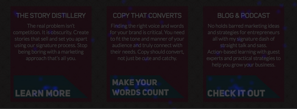
Lots of great insight thanks to the heatmap. The first key learning is that people actually do use the three boxes towards the bottom of my home page to route them to other pages on my site.

home-page-heatmap-boxes
Home page heatmaps with click activity


However, the click through rates for the boxes were averaging around 1-2%, so I looked closely at them and realized the calls to action were weaker than I’d like, so they were changed. As you can see in the image below, they were blue, meaning they were getting some traffic but there was lots of room for improvement.

new-homepage-boxes
Home page boxes with new calls to action


We’ll see how the new calls to action for these three feature boxes work moving ahead, but early testing is positive.

From there, I started to look at where the real action was in my navigation bar, and it was all about services. Services received 16% of clicks on the page, with the blog receiving 13% and my about page 12%.

home-nav-bar-heatmap
Heatmap on home page navigation bar


This prompted me to switch gears from examining my about page to my services landing page, so I promptly put a heatmap on it. Because holy shiznit – services pages are critical to my business. How could I not know exactly what was going on??? I knew business was “good,” but I wanted to know what was really happening when they hit that page.

Here’s how clicks on the services landing page breaks down:

  • 13.3% on The Story Distillery
  • 18.2% on Copywriting
  • 10.2% on Ongoing Services
  • 8.6% on Guest Posting

(And yes, I know that’s not 100, but I’ll take 50.3% clicks on services to learn more. And those other 49.7% of clicks are totally random, but interestingly, 5% of them are to my praise page.)

This accurately echoes pretty much how my services break down in terms of revenue split, and it’s no surprise that copywriting is my lead service. With that in mind, I audited the copywriting landing page and subpages with a careful eye, as that group of pages is where a good chunk of my traffic is going, so I want to do everything I can to convert them.

Working with my designer, we made a series of minor tweaks to the copywriting services page, including clearer and more prominent call to action buttons and making the invite to book a consult more visually enticing. You can see the results of those tweaks here.

We’re also fine-tuning the other services pages in an effort to improve conversions for each page and will be setting up a goal for each page  in Google Analytics so we can see how we’re doing. Right now, all post-purchase thank you pages are hosted by Infusionsoft. We’ll be moving those back to WordPress so we can track them as soon as design/development changes are completed for those pages later this month.

If you want to learn more on how to set up a goal in Google Analytics, you can view the process right here:

Conclusions

My gut was totally wrong about what was happening on my home page and seeing the numbers first hand made a significant difference in the actions we took. Instead of enacting major changes, we kept what was working and started to fine tune.

Each of these changes will continue to be tracked via Google Analytics and heatmaps  in the coming months, and the use of Google Analytics goals on each thank you page will let us see how many people go from landing on the site to ultimately purchasing.

Taking Action on the Lab Report

The point of the lab report is for you to get into action and take some of the testing and experimenting used here to see how you can start to use more data and facts to help you shape your marketing.

Here are a few things for you to dig into:

  1. What’s your bounce rate?
  2. What could your heatmap tell you about what visitors are doing?
  3. Do you know what’s happening on your services pages?
  4. Where can you use a goal in Google Analytics?

It’s important to keep in mind that you don’t have to have massive amounts of traffic to start digging into what’s happening. In fact, if you can figure out what’s happening now, you’ll be ready to capitalize on traffic as it rises over time. Because there’s nothing worse than traffic that you aren’t ready to actually convert into action.

That’s it. Lots learned this month about my website and what people are really doing, as well as what we need to change with an eye on improving conversion rates.

From here on out, lab reports will drop early each month and I’ve got some fun experiments planned, including:

  • Can Maggie grow her Pinterest following the same way she did for a crafting business?
  • Your Facebook ads cost what? Breaking down the real cost per lead.
  • Adventures in list building leading up to a launch.
  • And much more…

[Tweet “The first monthly lab report from @magspatterson: breaking down bounce rate and heatmaps”]

Categories
content marketing strategy conversion rate strategies

The Real Reason You Need to Care About Your Conversion Rate

The-Real-Reason

If you build it, they will come. (Insert other tired clichés here.)

When it comes to the web, that’s sooooo not the case. For some reason, even in 2015, we’re conditioned to think that you launch your site and ta-da! The world will be SO excited and you’ll be drowning in traffic.

Nothing could be further from the truth. To have traffic (aka visitors) to your site, you’re going to need to hustle. From blogging to social media to guest posting to whatever else you decide to do, you’ll need to put time in to getting them to your little slice of Internet.

And once you’ve done the hard work of getting them to your site, the even harder part starts…keeping them there.

Unfortunately, this is where so many websites (especially in our online entrepreneurial world) fail. Epically. Massively. Disastrously.

There’s countless reasons this happens, but the bottom line is that if you have visitors coming to your site and you’re not converting them, all of your efforts are a bloody waste.

If that seems dramatic, hold on to your hat – because it comes down to simple math:

Let’s say you get 100 visitors to your site, but only 2 convert into a sale, which gives you a 2% conversion. If you want to make more sales and more money, do you try to double the number of visitors to your site?

Or do you improve your site so you can get 6 or 10 of the visitors to buy from you? By improving your conversions, you’ll get 3x or 5x the sales from people already visiting your site.

So in classic sales speak, do you serve the people you already have or do you work to acquire more leads?

As someone who literally built the foundation of my business on referrals, I know exactly what I’m going to do in this situation. I’d focus on ensuring that the people already coming to me are getting what they need to improve my conversion rate, instead of hustling and grinding to get more and more and more traffic.

The answer isn’t more traffic, it’s more conversions on your site. If you want to reach your business goals, you need to give a flying fig about this conversion rate stuff. (Even if you’re a creative and math makes you all stabby, because this is the stuff that impacts your bottom line and very likely your sanity.)

So, why, then, are so many sites failing when it comes to creating the connection with visitors and closing the sale?

[Tweet “Your website doesn’t have a traffic problem. It has a conversions problem, says @magspatterson #conversionschallenge”]

Here are just a few of the reasons it happens:

#1. Pretty Over Practical

Have you ever arrived on a stunning website and thought, “Okay, this is so cool. Wait, WTF am I supposed to do now?” Me too, and way more often than I care to admit.

While we can all make fun of the web 1.0 sites out there from the Internet marketing dudes that are red, black and yellow, I’ll tell you one thing, those sites often convert like gangbusters. They work because they are extremely well thought out and use proven principles to move people into action.

Does this mean you need an ugly site from 1999 to convert visitors? No. Hell no. But it does mean you need to get much more intentional about what you want your visitors to actually do when they land on your home page. You need a plan that takes them from home to the place where you want them: a place where they feel comfortable enough to opt-in, buy, or get in touch.What’s the plan that gets them from home to the ultimate place where you want them to opt-in, buy or take action?

It’s way too easy to be caught up in the cool design, groundbreaking images or funky navigation. But if your visitors don’t get it, it doesn’t matter.

When you’re assessing designers, you want to look for someone who speaks the language of conversion and digital strategy. Pretty is great, but if your site isn’t doing its job, it’s not going to give you the ROI you need. In a world where User Experience (UX) and User Interface (UI) are critical (thanks, Apple), you can’t afford not to have a clear plan for how people interact with your site.

#2 Copy That’s Clever, But Not Clear

Way back in the day, when I was studying writing for the web, we had a catchy way of assessing our writing, and we were marked against this filter. Meet the 4Cs: – clear, correct, complete and concise.

If your copy can’t pass that test, you may have a conversion problem.

Clever, cute, quippy, whatever you want your copy to be, you can’t sacrifice clarity. Because without clarity, no one – and I mean no one – is going to be able to decipher what you’re really saying. And that means they’re they are not going to stick around to sign up for your list or read more about your products or services.

Truth is, as attached as you may be to your words, cut that by about 95%, because that’s about how much your reader really cares. Yes, you need to connect with them and address their problem, but they also want you to do it in a way that doesn’t make them feel like they’re a Ph.D. candidate or that they need a dictionary to understand.

If you want your copy to convert, you need to answer your customer’s most burning the question: “What’s in it for me?” and then make sure that you’re speaking your reader’s language. And if you really want to have copy that gets results, please don’t confuse conversion-boosting copy with the breed of personality-driven, fluffy copy that’s all style and no substance.

#3 You’re Making it Too Damn Hard

Nothing, and I mean nothing, kills conversions like making it too damn hard for a visitor to do business with you.

If you really want people to convert, you need to make things dead easy for them to follow through. From clear pricing to answering questions upfront to having calls to action that make sense, your job is to reduce the number of decisions they need to make.

It’s called Decision Paradox. And if you’ve ever been to the Cheesecake Factory, you know exactly what that’s all about. When we have too many decisions, we tend to over analyze things. So the fewer decisions you can offer up for your visitors, the better.

A great example of where many online businesses make it too hard is with pricing. If you make it hard for your visitor to figure out what something costs and how to do business with you, you’ve just created friction. With every second they spend doing math or figuring out what happens if they do press buy, you’re giving them time to reconsider.

Same thing with your call to action buttons. You need to make it so crazy simple that they can take action on autopilot and feel like they’re making the right choice. Asking for too much info, making them click one too many times, or being unclear means more decisions. And with every decision, they become more apt to abort their mission.

Life is hard enough, so if you make it hard for visitors to get the information, purchase or subscribe, you’re not building trust, and you’re less likely to convert them into action.

Think about your favorite stores or brands. I’m willing to bet they’re the ones that make things simple. Their merchandising, their pricing and the overall experience is relaxing and makes it easy for you to give them your money.

Your website should do the exact same thing. Less is more, especially if you’re talking conversions.

[Tweet “Are you making it HARD to do business with you? @magspatterson breaks down common problems”]


Categories
content marketing strategy The Marketing Moxie Show

Episode #70 – Become A Blog Genie (Three Wishes Optional) with Rita Barry

Become-a-Blog-Genie-(Three-Wishes-Optional)-2 (2)


Blogging is one of those business things we do over and over…and over, which means it turns into a chore. But don’t worry, today’s guest Rita Barry has us covered. As a pro blogger, Rita has some amazing advice on how to build a blog with real traffic, create systems and much more.

Items Discussed in this Episode:

  • How Rita went from a hobby blogger, to a professional blogger to teaching blogging
  • Rita explains how the healthy living blogging community inspired her to start blogging and getting to know that community
  • We can try to force a result or an outcome in our business, but sometimes things are going to happen as they should
  • The top things people don’t realize about building a blog
  • Rita explains how the amount of work that goes towards a blog can deter people, but can be totally worth it to grow your business with the right help and plan
  • Networking and building relationships is key to developing and growing your blog
  • You don’t have to network with people who you wouldn’t normally build a relationship with, you can connect with people you would truly be friends with so it’s not fake
  • Rita talks about systems to fill the gaps for bloggers: it’s not just as simple as ‘write, post, publish’!
  • Figuring out what your steps are for creating a blog is key, then break it down for the week so you don’t sit down to a blank screen on Tuesday night to publish Wednesday

Top 3 Takeaways for this Episode:

  1. It looks easy to publish a blog. You need to take the time to delve into the individual steps you take to publish your blog from start to finish. Nailing down these steps will help stop you from feeling so overwhelmed.
  2. Understand the importance of online relationships. It’s not just good enough to blog or spend our time writing, we have to take the time to actively engage with other bloggers and our readers to be able to cross-promote and get your name out to a wider audience. Do it from a place of genuine service and the rewards will follow.
  3. Look at your blog systems. Maybe you need a blog systems overhaul. Really look at where your systems need help, where they bottle neck, and where you’re falling down. It’s really important to understand that without a blog system, you may be skipping vital parts.

subscribe now button new

Links for this Episode:

bloggenie.ca

Link to Free Marketing Moxie Facebook Group

Categories
content marketing strategy

Falling and Failing: My Simple Guide to Succeeding in Business

blog-graphic-falling-and-failing

Have you ever had a really klutzy friend? You know, the one who falls for no apparent reason or is the first to spill stuff on their new white shirt?

I’m that friend. I fall for no apparent reason, to the point where it doesn’t alarm my closest friends anymore. Last year, I attended the New Media Expo in Vegas, where I met up with a bunch of my online peeps for the first time.  As we headed towards our table in the lovely Bellagio restaurant, I tripped and hit the deck, drink in hand. I quickly jumped back up, and being that I was at the back of the line, no one was the wiser.

When you fall, spill things and have very little grace, you quickly learn how to get over yourself. How to recover, make a joke and move on.

I consider that an apt metaphor for being in business, especially with everything I’ve been through running multiple businesses over the past 10 years. To succeed, you need to be willing to fall down and fail all the time.

Over the years, personally and professional, I’ve learned to become spectacularly good at failing. I’m really good with scraping my sorry ass off the floor hundreds of times until I nail it.

The way I see it, we have a choice. We can fail, or we can play it safe and blindly follow the experts and gurus and all their so-called wisdom. Or take another course. Or hire another coach.

It’s so much easier to be told what to do, keep learning or seek more opinions than be willing to jump out of the damn plane and see what the hell happens. Currently, I’m living this approach as I get ready to try out some new things in a very public way.

Jumping is damn scary. Which is why I’m going to be the one to put on my parachute and hope to hell that the rip cord works. I’m going to do it for you, so you don’t have to fail or fall quite as hard.

[Tweet “New blog post – Falling and failing. @magspatterson’s guide to business success.”]

Putting My Numbers Where My Mouth Is

It’s no secret that I’m tired of BS advice and people talking complete shit about how they built their business, with no context or frame of reference. Experts that pop up overnight and claim to have all the answers, but have zero proven track record doing it for anyone but themselves.

Or naive newbies thinking they can have a $100K launch with a 100 person email list, just because. Big dreams and heaps of false hope drive too many new online businesses.

While success can happen very quickly for some and will take years for others, a little practical, grounded perspective from the trenches is so needed. Plus, in good faith, I can’t talk about the problems I see out there, unless I’m willing to be part of the solution.

Starting in April here on the blog, I’m going to share a monthly “lab” report of what’s working and what’s not with my marketing. It may be painful some months, but I’m ready to put it out there to show what it really and truly takes to build a business in a sustainable, ethical way.

As a marketing pro, I know this opens me up to judgements of my skills and talents, and if that’s how people choose to take this, they aren’t people that should be working with me, ever. My approach is always based on testing and correcting (because none of this stuff is off-the-shelf) and by the idea that true creativity and connection only happen when you take some risks.

A big part of the lab report is going to be numbers, because while I’m definitely a creative type and I nearly failed 9th grade math (52% woot!), I simply adore what I call marketing math. This is not talking about my income and how much I spent; rather, it’s about the numbers behind marketing and building a business.

Things like conversion rates. List growth. Cost per lead. Results of A/B tests. Stuff that if you’re more creative may make you want to duck and cover. But these are the things that happen behind the scenes, and I wish someone had shared with me in detail about succeeding in business.

Are you ready to succeed? Then come fail with me, or at least laugh along when I fall on my face and try not to spill my fancy $15 mojito.

[Tweet “Falling with grace and humour, and not spilling the $15 mojito with @magspatterson.”]

Categories
content marketing strategy

The Real Cost of Your Bargain Basement Copywriting

blog 3.19

A few weeks ago, I was doing a podcast interview and the topic of how to become a better writer came up. My stance on this was pretty clear: that as entrepreneurs, needing to write copy is inevitable. So, no matter how “good” of a writer you may be, you need to always be working on developing your writing skills.

The reality is that it’s not feasible for most people to outsource most of their copywriting. All of us should be working on developing solid copywriting skills and learning how to write for the web.

On the other hand, nothing makes me more crazy than the consistent devaluing of the role of a content strategist and/or copywriter in the website process. This is actually something I run into day in, day out as I go about my business. It needs to stop.

Copywriting for your fancy new website shouldn’t be an afterthought. Or worse yet, the thing you decide that you can DIY because you’re a “good enough” writer. Do you really want “good enough” results for your business, too? What’s the real cost of your bargain basement copywriting?

Here’s some food for thought when it comes to your next project that needs copywriting:

Plan First, Design Second

Typically, most people hire their designer first when they’re getting a new site ready to go or undertaking a rebrand. But how do you hire someone who “gets your vision” when you have no idea what your plan is? When you’re not even sure what direction you’re going in?

Hiring your designer, then waiting until much later to figure out copywriting and seeing how much money you may have left over for it, is a bad plan for a sundry of reasons.

First, you may make your designer go bat-shit crazy, as you’re not sure on key things such as how you want to structure your copy, what the buyer’s journey is on the site, and more. Expecting your designer to figure out everything that should be planned out via a Content Strategy is unrealistic and will potentially waste a lot of time.

Second, you hire your dream designer to create a truly amazing website, but now you have to DIY your copy because you’ve blown your budget on design.

In most cases, design should cost more than copy. But when you’re budgeting for your website, it shouldn’t be a 90/10 split in favor of design. It should be more like 70/30. So if you’re spending $7K on design, plan for at least $3K for your copy.

Without an appropriate budget in place for copy, you’ll end up DIYing it or get stuck with mediocre copy because you had a miniscule budget.

End result? Not having enough budget for copy will result in you ultimately doing your shiny new digital home a major disservice. No matter how beautiful your site is, if your copy doesn’t hold up it’s end of the bargain, your site isn’t going to help you meet your big goals.

[Tweet “Are you doing your website a disservice with your craptastic copy on a beautiful site? Post from @magspatterson “]

Mediocre copy from a friend of a friend who’s a “writer” is kind of like getting your wedding photos done by your cousin Larry—lackluster at best.

Then there’s the issue of conversion. That so-so copy sure as hell isn’t going to convert because all of your calls to action will be things like “submit,” and your copywriter, Mediocre Morty, will think that slider on your home page is a fantastic way to get more words on the page. (For the record, this is a horrible idea. Sliders totally suck.)

Think Before You DIY Your Copy

Let’s say you’re going to skip the pro copywriter route, and you’re planning to DIY all of your copy. It’s not the worst idea ever, until it is because your designer needed the copy yesterday and you’re staring a blank Google Doc.

Can some people really rock their DIY copy? Totally. I’m not so high and mighty as to think that only a pro can get the job done.

But do you know how many people end up stuck, frustrated and pulling their hair out? Too. Damn. Many.

I know because I talk to people like this every single week who finally decide to “suck it up” and hire a pro to handle it instead. Or they need to hire someone to fix a botched copy job from Mediocre Morty. It’s a crying shame because at that point, they’ve wasted so much time. Hours of their lives were wasted and are gone for good. Ones that would’ve been better spent, you know, working on their business or actually living their lives.

A few considerations for going the DIY route, starting with this: if you’re leaning this way, figure out why. Is it to save money? Are you worried that it won’t sound like you? These are legit concerns, but they just aren’t good enough in my book.

Think about how nonsensical it is to spend $4K on a pro photoshoot and $6K on a new website, then be unwilling to see the process through with copy that holds up it’s end of the bargain. Investing $10K on the visual side and $0 on copy that actually tells your story and sells your stuff is just plain crazy.

Unless you’re one shit hot writer, this is the definition of dumb. Sorry, but it is. Go pro all the way, or go home. (Getting A+ on English papers in high school doesn’t mean you’re good enough.)

If you’re hell-bent on DIYing your copy or need to go that route, invest in learning how to do it right. Learn the structure of pages, how to set up copy for skimmability, what the goal of pages should be, and most importantly, some basics on website conversions.

Given that writing is a cornerstone of running a business, training on this isn’t a bad idea, not for a second. Just know that you’re going to need to invest time and money in improving your writing skills and understand that it takes practice. (If you want solid copywriting training, check out my buddy Courtney’s Total Knockout course, which is open for registration right now. No affiliate income, I just like what she’s dishing up.)

As you plan updates for your site, or a shiny new one, don’t go bargain basement with your copy. Hire a pro, or learn to do it right, because with anything else you’re not doing your story, your design or your business any favors. Your business deserves words that work for you and help you get where you want to go.

[Tweet “The real cost of the bargain basement copywriting on your website. New blog post from @magspatterson”]

Categories
content marketing strategy social proof The Marketing Moxie Show

Episode #60 – Crafting Customer Proof That Sells For You

Crafting-customer-proof-that-sells-for-you (1)

Too often when it comes to preparing copy for our site customer proof is an afterthought. It’s not just about having some testimonials and calling it good, but crafting customer proof that sells for you. Well done customer proof can help do the heavy lifting as people decide whether or not to buy from you.

Items Discussed in this Episode:

  • How do customer proof and copywriting go together?
  • Think of customer proof as storytelling, not just having a bunch of quotes on your site
  • The problem with negative social proof is and how to avoid it
  • How to strategically place the different kinds of customer proof on your site: small quotes, case studies, client interviews, etc.
  • Don’t shy away from sharing your customer stories on social media, publicly showing your connection to your clients is a good idea
  • How to actually go about collecting customer proof and how to do it in a timely fashion
  • Some pointers on how to actually present the information from your clients in a way that speaks to a result potential clients can achieve by working with you

Tips for Creating the Content Once You Have the Customer Proof:

  • Always tell the story that speaks to the result. Every quote, every case study, etc. should speak to the actual impact and outcome the client got from working with you. You want a ‘before’ and ‘after’ feel.
  • Check your tone. Always make sure your tone is on point with your audience and actually sounds like your client would.
  • Keep it short, especially with your quotes. Less is actually more.
  • When you’re actually writing your customer proof, look at the rest of your content to figure out where you want to actually place them. You want the quote to fit in with everything else on the page.
  • Make sure when you interview a client that you have a plan in place to get specifically what you need.
  • Don’t let customer proof be an afterthought. Social proof is so powerful that really great social proof is more motivating to buyers than a discount.

Top 3 Takeaways for this Episode:

  1. When it comes to customer proof, always think about the storytelling and ‘before’ and ‘after’ effect for the client.
  2. Be very intentional and intelligent about how you will be using the social proof. How you’re going to write it should be dictated by the form and the medium you’re going to use to present it.
  3. Don’t let your case studies be something you scramble to get. Ask your customers and create time on your calendar to get the feedback. This is gold in your business!

[Tweet “Don’t let customer proof be an afterthought. Craft customer proof that sells. New episode from @magspatterson”]

subscribe now button new

Links for this Episode:

Link to Free Marketing Moxie Facebook Group